
Michael Richardson runs a popular retro website RetroSelect, which provides useful information on retro styles (concentrating on ceramics and glass) from the 1950s to the 1980s. Features of Michael's website include: a style finder; tips on collecting retro; Ebay buying; books; associated links and displays of collections - well worth a look. Thanks to Michael for writing this interesting article which we hope will promote the collecting of Myott retro ceramics.
Myott does not appear on the radar screen of most people who collect ‘retro’ ceramics. Best known for its wonderful art deco, as well as its mass-market transfer ware, Myott produced relatively few pieces that have a truly retro style. What they did produce, however, deserves to be better known.
To begin with, it is worth saying what ‘retro’ is. Retro is anything that comes from the past, but nonetheless looks startlingly different and modern compared to the ‘traditional’ styles around at that time. In ceramics, ‘traditional’ styles include quaint floral patterns, blue-and-white, dainty gilded rims, rococo curves and fluted edges. Retro flies in the face of such styles by using bright or contrasting colours, cheerful – even silly – designs, and unconventional shapes such as freeforms. Traditional styles would be used by granny to serve tea to the vicar, whereas retro styles would be bought by her grandchildren to show how modern they are.
Which brings us to the problematic question of art deco. In many respects (for example, its bold colours and patterns that contrast with traditional styles), art deco could be called ‘retro’. However, most people would say that retro is not just a style but also a time-period – namely, the 1950s to the 1970s. For this reason, I sadly leave Myott’s deco production to one side and look at what they did after the war.
The lack of records of Myott designs, and the scarcity of information in books, means that I have to piece together Myott’s retro output from the pieces themselves. Myott’s postwar production can be divided into traditional styles (such as the ubiquitous 'Finlandia' blue and white pattern), and retro.
I know of one range that was part tradititional and part retro. It carried a very retro pattern resembling a giraffe skin, with big pale brown blotches; but was applied to a traditional style rimmed tableware body.
The 1950s saw Myott use a retro body shape with a simple curved profile and rimless (coupe) flatware. This body shape closely resembles the Fashion shape (1955) of Midwinter Potteries. Other factories, such as Ridgway, J & G Meakin and Empire Ware also produced similar shapes.
 Fifties coupe body styles |
Fifties coupe body styles were quite similar across a range of Staffordshire factories. Left to right: Ridgway (Homemaker pattern); Midwinter (Monaco pattern); Myott (Miami pattern). |
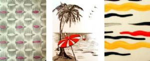
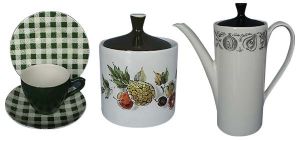
Myott 50s tableware carried a range of attractive patterns, both transfer and/or hand-painted. One example is a chequers pattern with black hollow-ware, reminiscent of J & G Meakin’s Checkmate . Another, unnamed, had lilac hollow-ware and a complex pattern of black lines with hand-painted lilac details (see figure below, left).
Miami was a range of table ware decorated with a transfer of tropical beaches with palm trees and beach umbrella; the red highlights were hand-painted. This fabulous design is an and echo of Beswick’s high-kitsch ‘palm-tree’ ceramics first issued before the war.
Myott’s Gaylord was another great series: the hollow ware is a very bright orange-red. The flatware is hand-painted with black, red and yellow wavy lines resembling in shape the black stripes on Midwinter’s Zambesi range. Both Miami and Gaylord were helpfully backstamped with the pattern name.
|
Left: Unnamed Myott flatware pattern, c. 1950s; had matching lilac hollow-ware. |
 Myott retro patterns |
The Safari range carried a blue script backstamp, a speckled stone-like glaze, and hollow-ware in a variety of solid colours. The coffee pots and milk jugs in this range are very organic and strongly resemble 50s tableware from Poole Potteries. One pattern variant in the Safari range is Night Sky, with black and red stars; another is April Showers, decorated with scattered leaves.
In the early 1960s, David Queensbery at Midwinter Potteries started a trend for tall, cylindrical forms. Portmeirion took this trend a step further and developed very slender, elongated forms with long spouts. J & G Meakin (in their studio range) as well as Myott, followed these cues, and developed tableware ranges that were the basis for a variety of surface decorations. Myott’s In Tone, for example, had a twintone scheme of chocolate brown hollow ware and honey coloured flatware.
 Myott retro patterns |
Left: Green Chequers pattern (c. mid 50s) |
Hawaii had a transfer print of tropical fruits in the subdued, earthy colours typical of the early to mid sixties. Earthy tones are also seen in a range with brown flatware and a transfer print of flowers in sepia browns and muted greens. The minimalist but elegant Silhouette was more spartan, having a simple monochrome transfer band of fruits, and plain white or black holloware.
A final interesting point. Collectors of Myott retro will have noticed that their sixties tableware sometimes carries a pattern called, according to the backstamp, Bermuda. A typical sixties pattern of simple, stylised flowers. But of course Bermuda is a sixties remake of Myott’s wonderful, lush transfer pattern of the same name dating from before the war. So, which is better, Bermuda traditional or Bermuda retro style? I hate to admit this as a retro collector – but I prefer the traditional version.